If you’re marketing software, you naturally want to show off your feature-packed and easy-to-use user interface. Determining why users should be interested in your solution is key to deciding what to show them. But keep in mind that you’re marketing, not demo-ing. Here are a few different approaches to conveying business benefits while making your software look good. Here are a few ideas for showing a user interface in your explainer video.
Features and benefits without screens
User interfaces are designed to perform tasks and provide visibility into collected data. So the decision on what to show and how to show it comes down to which tasks and data sets to show off.

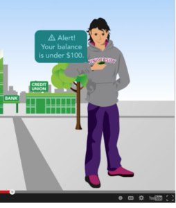
If the process is routine — like checking a bank balance on a mobile device — there is probably no reason to show it at all. The point you want to make is that this ought to be routine, and it is. So, in this presentation for a company that makes software that financial institutions re-sell to their customers, the emphasis is on the target market, millennials, not the software interface.

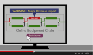
Similarly, if the key product benefit is insight into the business, it may be preferable to bring out that insight in the context of a simplified UI. In this video, the software makes lots of useful details available to the operator, but the unique business value is in the ability to display network operations in terms of business impact. That comes across more clearly in a simplified illustration based on the real user interface.
Business results tied to screens
On the other hand, if the target audience for the video is potential hands-on users of the software, it’s important to show what the user actually sees. But this isn’t a tutorial. There’s no need to follow the exact sequence of operations through a lot of clicks, drags, and drops. You’re still addressing buyers looking for business results
Here’s an example from a video showing the software interface of a CRM application built on the Salesforce platform. A key benefit of the software is that it enables different departments to coordinate their efforts by presenting them with unified views of the customer. In the video, we show actual screens that might be of interest to different audience members. But the takeaway — supported by animations around the user interface — is each of these views helps the business achieve its goals.
The importance of advance planning
When the emphasis is on the visibility provided by the software, it often comes down to getting the big picture — performance dashboards, for example — or the small picture — surprising levels of detail or granularity. This is something that needs to be thought through in advance, and can be tricky when you start with demo screens. In a webinar, the presenter can ramble a bit to fill in details about how things work. In video, what the viewer sees is what the viewer takes away.

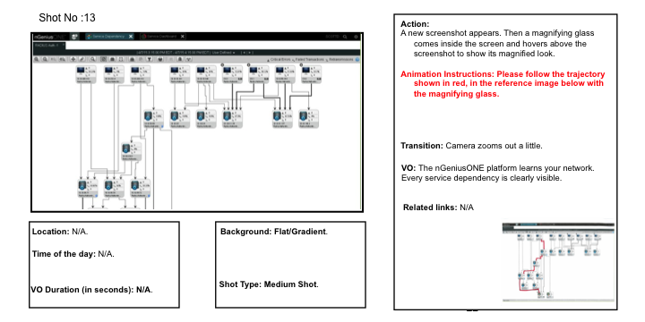
The storyboard illustration above shows instructions given to the animator. In this case, we also ended up masking identifiable customer data. That’s one reason we prefer working with hi-res screen grabs to working with recorded screencasts. Another reason is that, while screencasts show operations as they happen on the screen, callouts, motion, and graphics added to screen captures can guide the viewer’s eye to what we want him to view.
https://www.youtube.com/watch?v=l8pSVgJaNUY?start=45&end=104&rel=0&modestbranding=0
Here again, you’re not trying to teach people how to use the software. The details in the “demo” should establish credibility with a technical audience, but what you’re really trying to show is how easy it is to get business results with your solution, as in this example of a troubleshooting “drill down.”
Whether you show real screens in detail, or abstract screens impressionistically, in planning a software “demo” in a video, the first thing to nail down is the business results your demo demonstrates.


