 In videos that explain technology solutions, the on-screen action is never action-movie quality. Nevertheless, thinking through the sequence of images that will meet the viewer’s eye is arguably much more important than coming up with the words to accompany them in communicating insight into a technology in a video.
When we introduced Flash explainer videos in 2004, they filled a need for sales and marketing people who were having trouble bringing prospects up to speed on new technology solutions. Our videos still do.
Razzle-dazzle vs. insight
These days, however, video product and solution overviews are ubiquitous, and animation software allows for a lot more visual razzle-dazzle than was possible a decade ago. But razzle-dazzle by itself doesn’t communicate insight. Low-end explainer video companies offer a complete video “from your script” for a few hundred dollars. Some even throw in the script writing.
But if you want your viewer to take away insight into what makes your solution different, you need to present meaningful visuals more than anything else. And these meaningful visuals must be considered in the script from the outset — and modified along with the dialog as the script develops.
Writing for the eye, as well as the ear
I like to start with a script that reads somewhat like a screenplay, except that it is divided into more scenes (or shots) than a classic screenplay. As the script makes its way through subject matter experts, sales engineers, and others in the approval process, they are very apt to edit the spoken words with little or no regard to the images that the words are supposed to accompany. And people who are not accustomed to writing for video have a perverse tendency to use fluffy words like holistic that can’t be illustrated.
Storyboarding serves as a corrective to these ills — everyone is required to look at the pictures. Here is a scene as written in an early draft of the script for a recently completed project. The product is PatronManager, a niche CRM platform built on Salesforce.com. The target audience is executives who manage theater companies and other arts organizations. That’s why executives using management software appear in the first shot of the video.
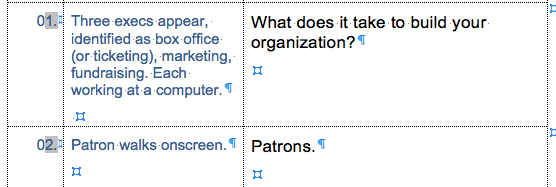
The underlying thought was to portray these managers as using siloed solutions, and then introduce a bit of a twist with the notion that the problem in not software per se, but software that is focused on tasks, not customers.
Rethinking visual thinking
This version of the script was approved, but when we created the storyboards with actual pictures, it became apparent that leading off with people using computers is a less-than-compelling representation of what is, after all, a visual business.
So we decided to open with patrons in a theatrical environment. This switches the emphasis from the product (CRM software) to the insight we want the viewer to take away: you need customer-centric software.
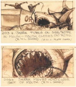
Storyboards help nail things down, though not everyone is equally skilled in reading them. The more ambitious the graphics, the more time you need to spend on them, because do-overs are expensive. (Of course, excellent storyboards don’t guarantee excellent results — Jaws is a great movie, but the scene with the mechanical shark pictured here is not among its best moments.)
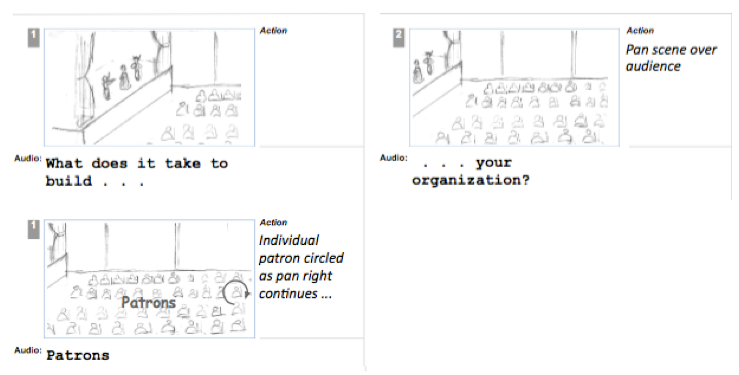
As the work on storyboards continued, we ended up changing the look and the point of view in the first scene.
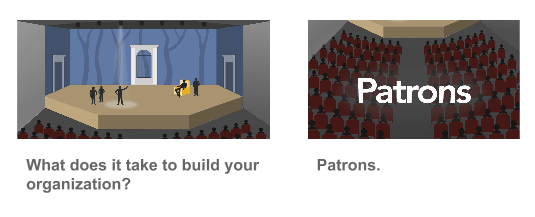
We changed it again in the actual video.

The thing to remember is that making a visual presentation that explains a technology solution clearly and memorably is an iterative process that requires everyone on the production side to focus on what the audience will see and take away. The more carefully you think through the visuals during the scripting process, the more visual information the viewer will take away — and the more cost- effective your video project.


